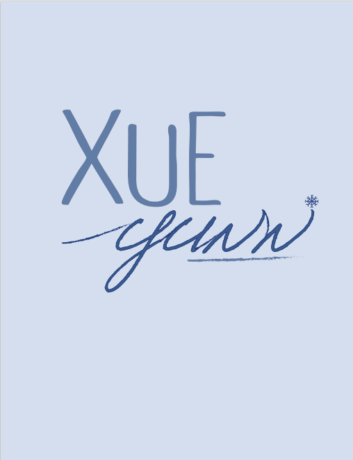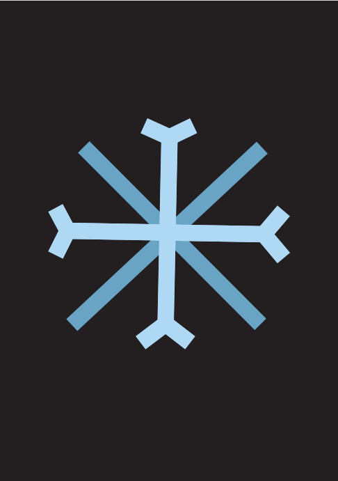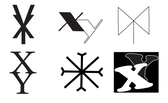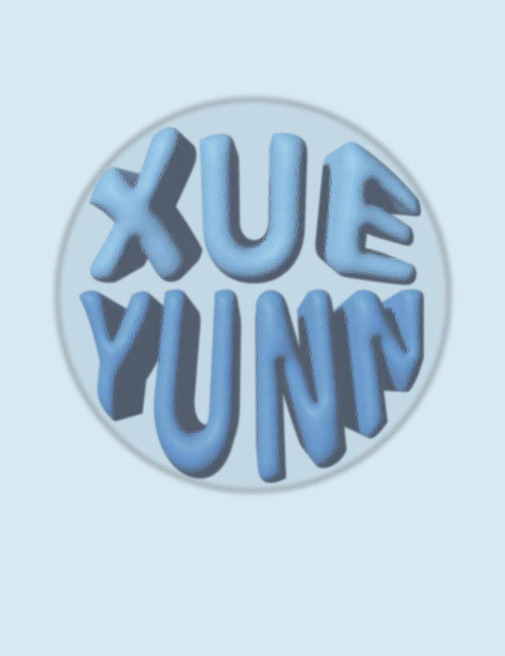
This project is a collection of name logo experiments where I explored different visual styles to express personality and creativity. Each logo uses a unique approach, ranging from playful 3D bubble lettering, clean handwritten strokes, snowflake-inspired geometric forms, to abstract monogram symbols. By trying various shapes, textures, and type treatments, I studied how different visual elements can change the mood of a personal identity. This project helped me understand typographic expression, logo abstraction, and how to translate a name into a memorable graphic mark.

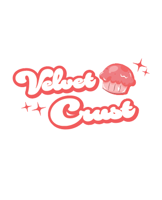
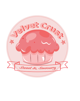
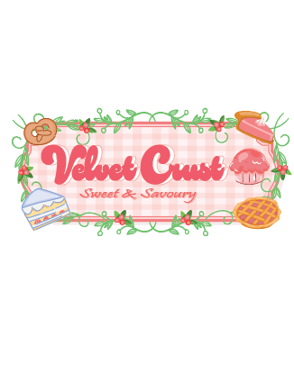
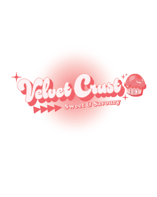
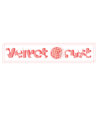
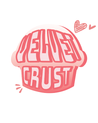
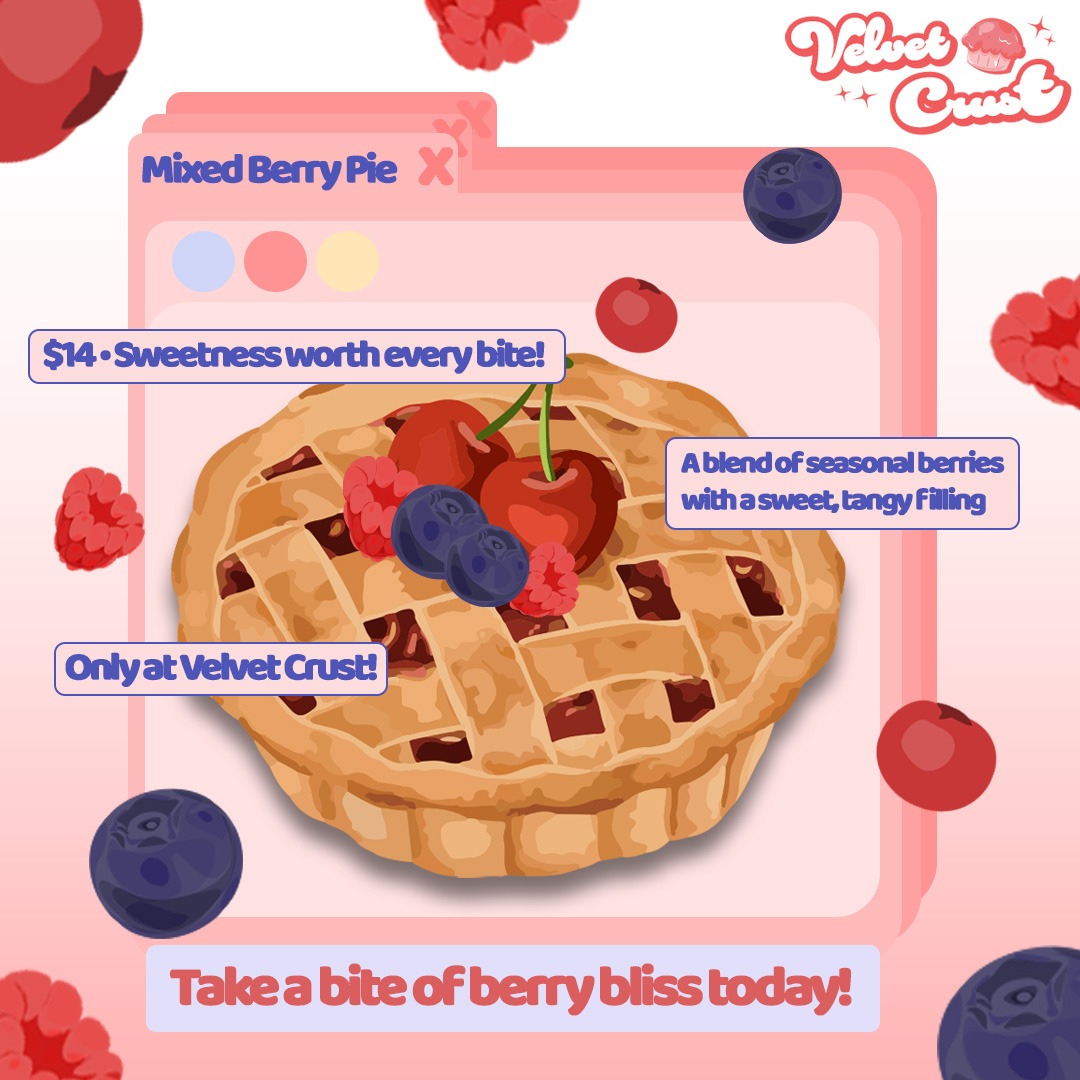
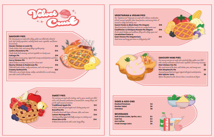
Velvet Crust is a pie shop brand that I designed based on the theme “Pastel Dreamland”.This project includes a logotype, a printed menu, and an Instagram post which focuses on soft pastel colours and gentle gradients, and a dreamy atmosphere that reflects the comforting feeling of freshly baked pies.
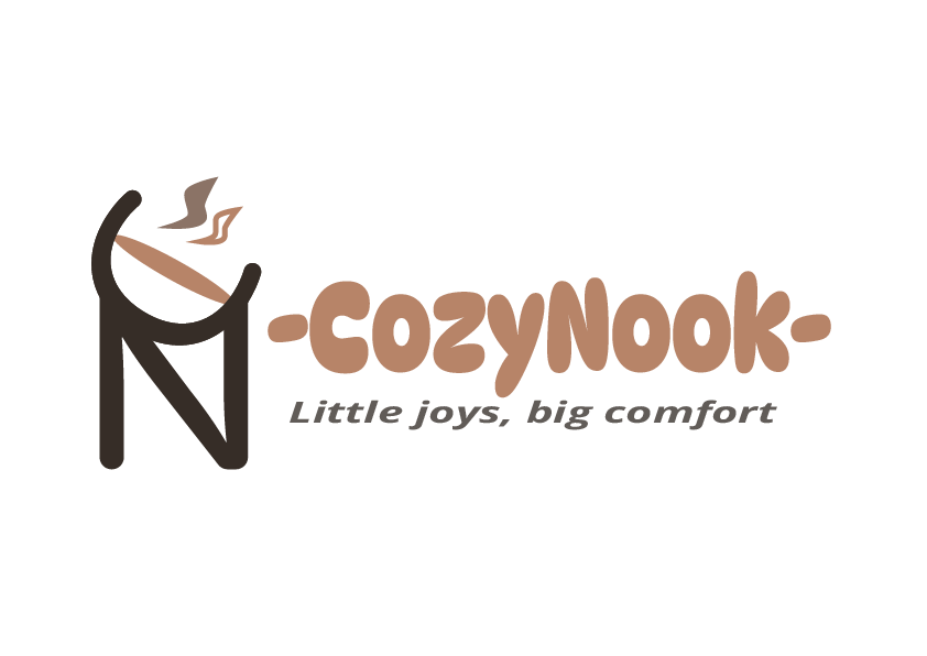
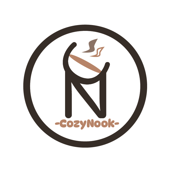
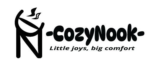
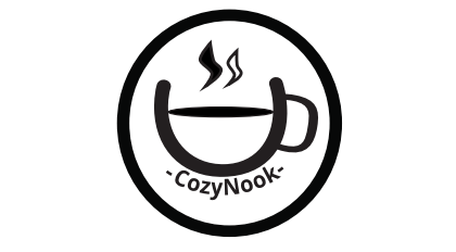
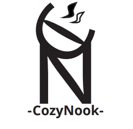
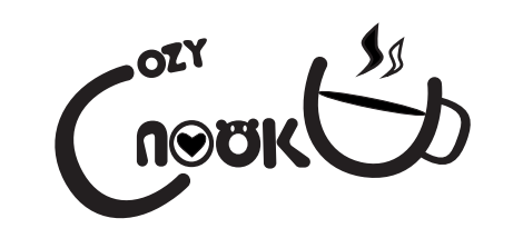
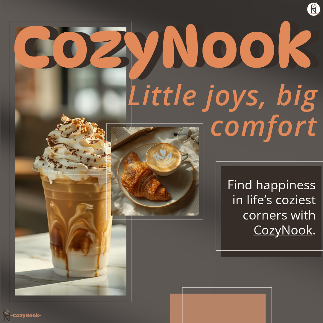
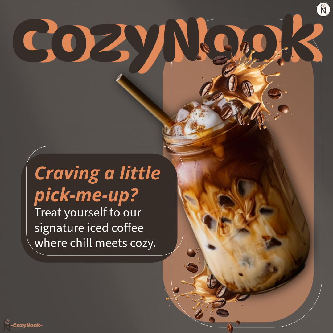
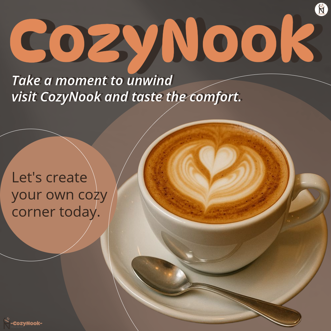
CozyNook is a café brand I designed to create a warm, relaxing, and healing atmosphere. I used a monochromatic brown colour palette to reflect comfort, calmness, and a cozy space for people to rest, unwind, or work. The branding includes the logo, brand style guide, and an Instagram post that highlights the café’s peaceful environment. Through this project, I refined my skills in colour harmony, typography, and creating a consistent visual identity.
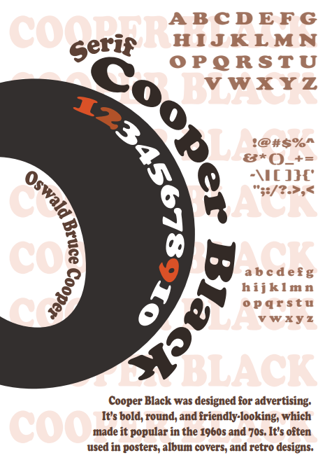
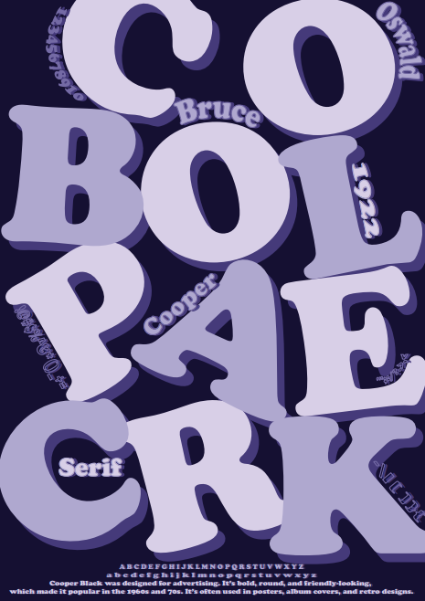
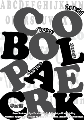
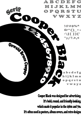
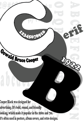
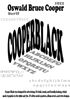
In this project, I experimented with the Copper Black typeface in multiple creative ways. By playing with different layouts, compositions, and font sizes, I explored how a single typeface can produce many visual identities. I even transformed the letters into a cube to push the design further. Through these variations, I learned how flexible typography can be and how layout choices can completely change the mood and character of a design.
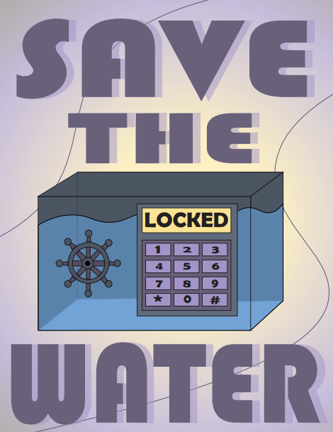
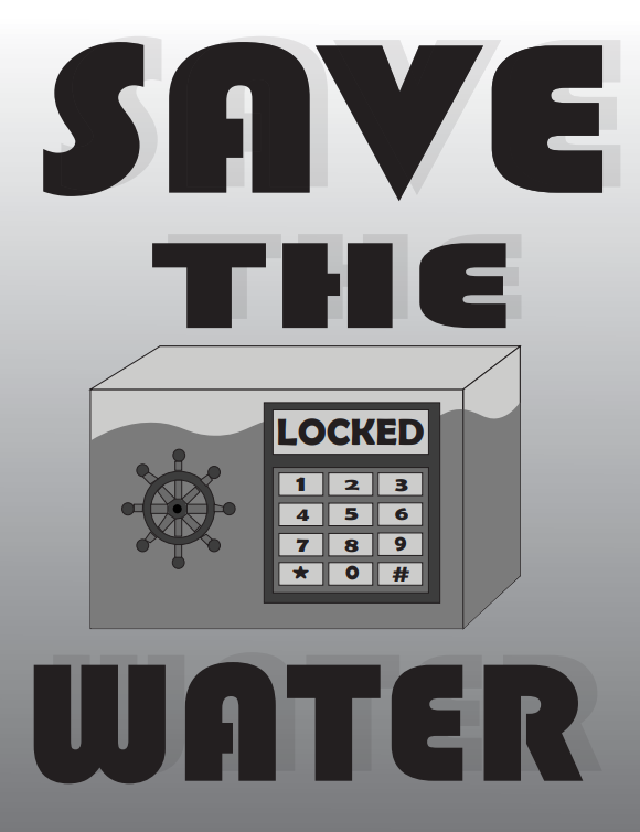
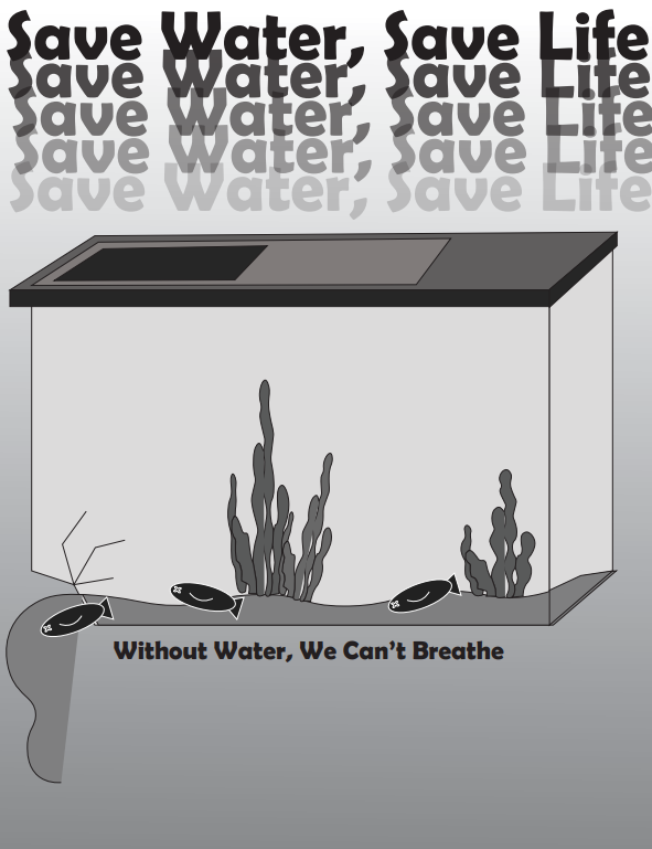
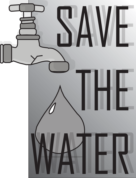
This series of posters focuses on raising awareness about water conservation. I experimented with different illustration styles, layouts, and compositions to communicate the message effectively, while keeping the visuals engaging and varied.
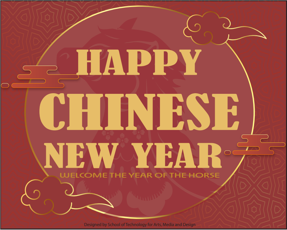
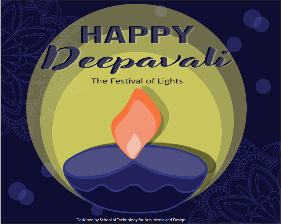
I designed e-cards for various celebrations, exploring diverse colour schemes, visual motifs, and playful arrangements. Each card reflects the festive theme while maintaining a visually appealing and balanced composition.
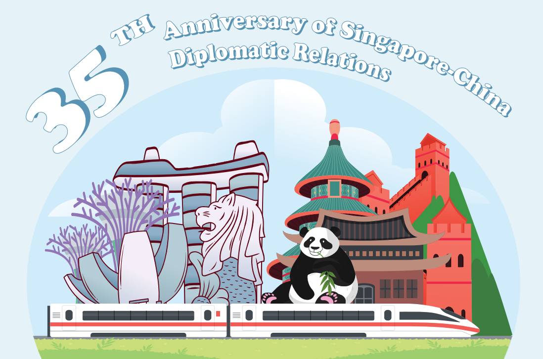
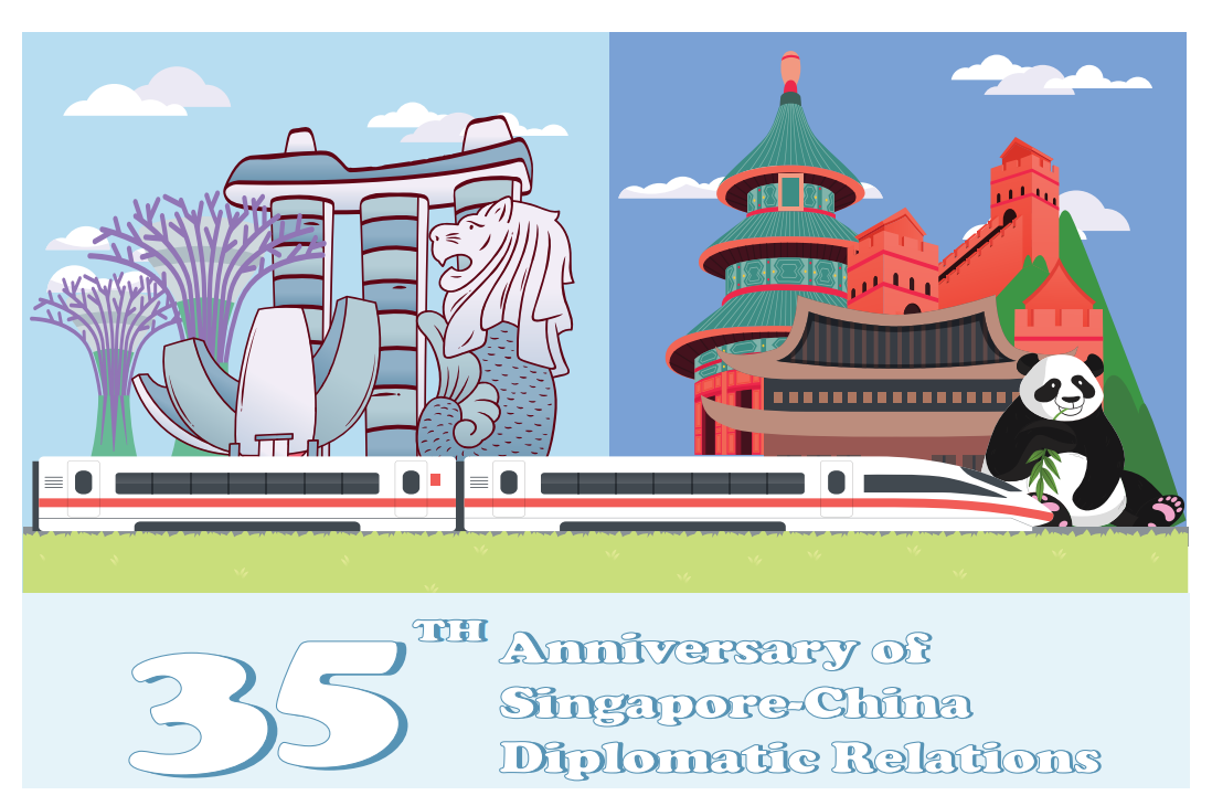
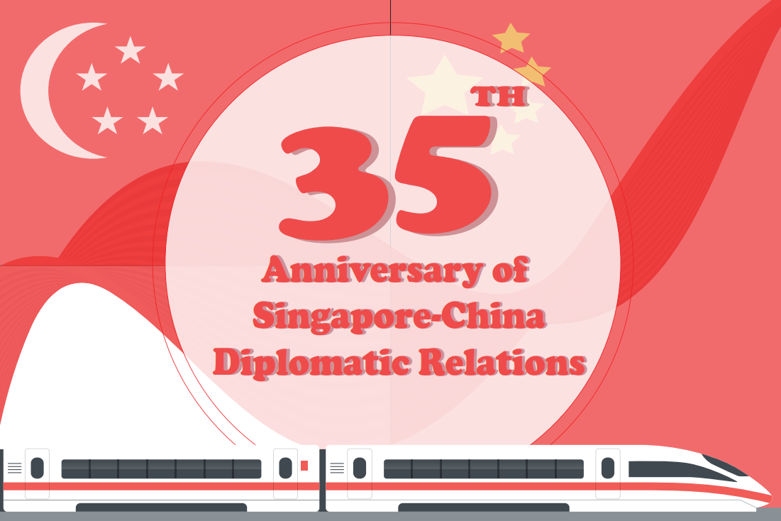
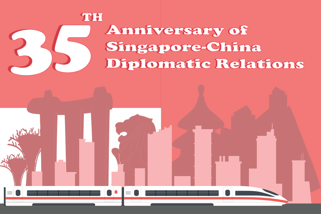
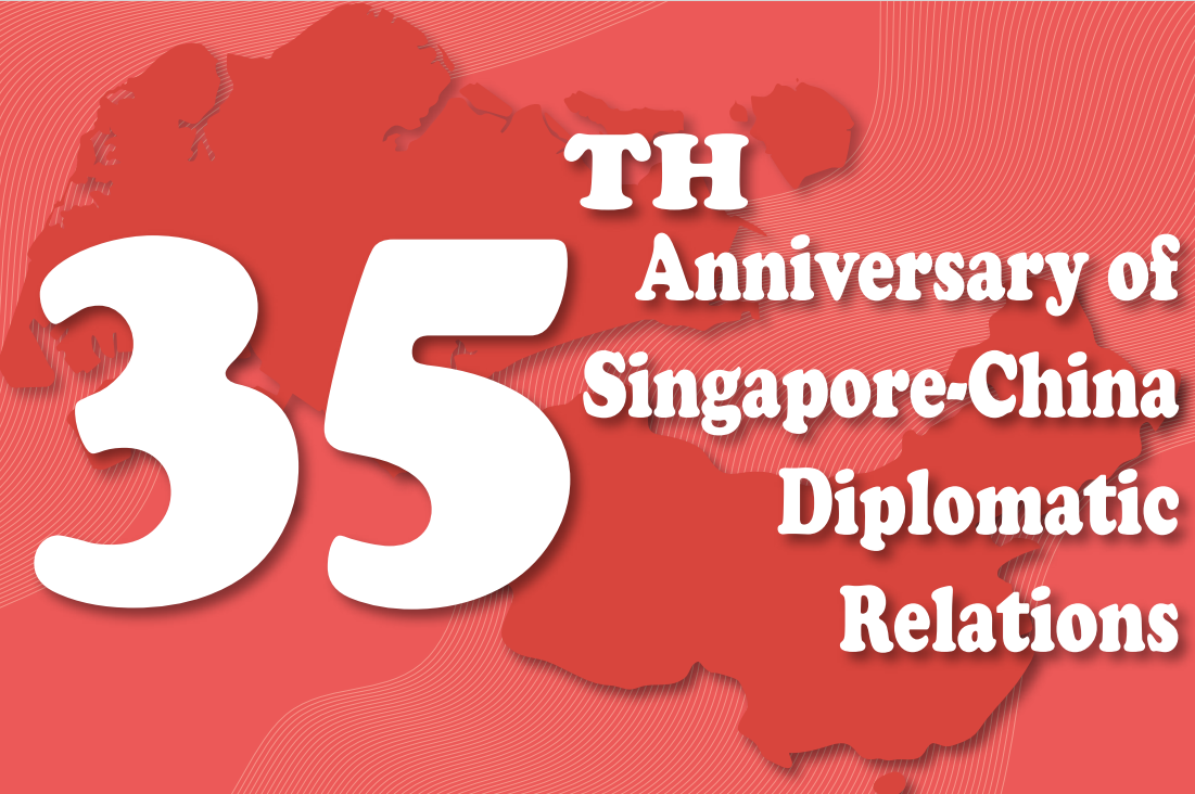
For this competition, I created several card designs that integrate landmarks, icons, and anniversary themes. The layouts are clean, modern, and functional, suitable for everyday use while remaining visually distinctive.
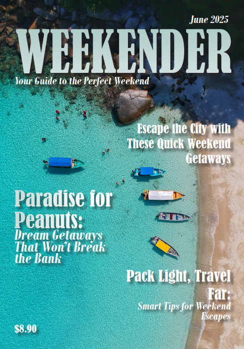
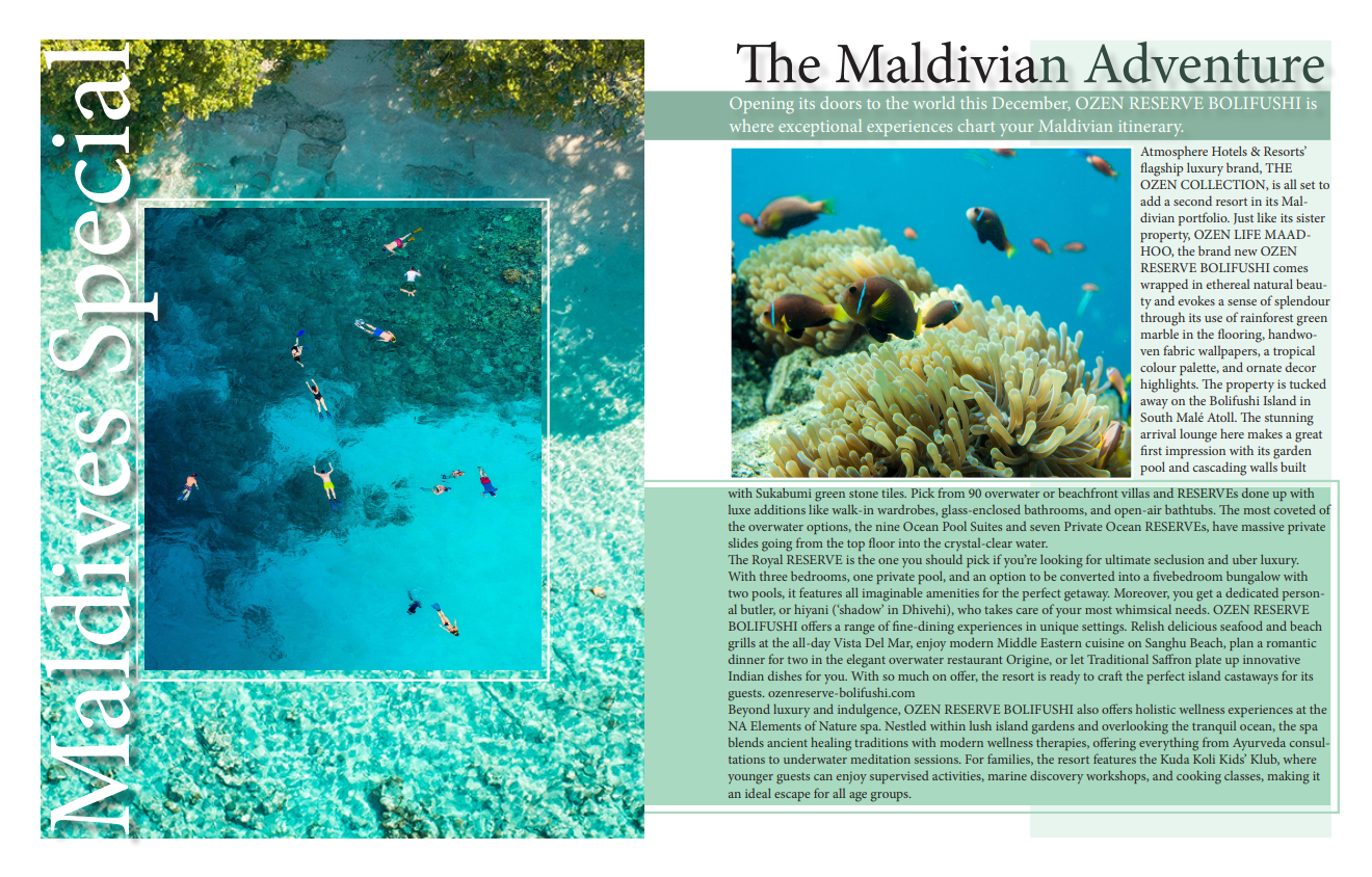
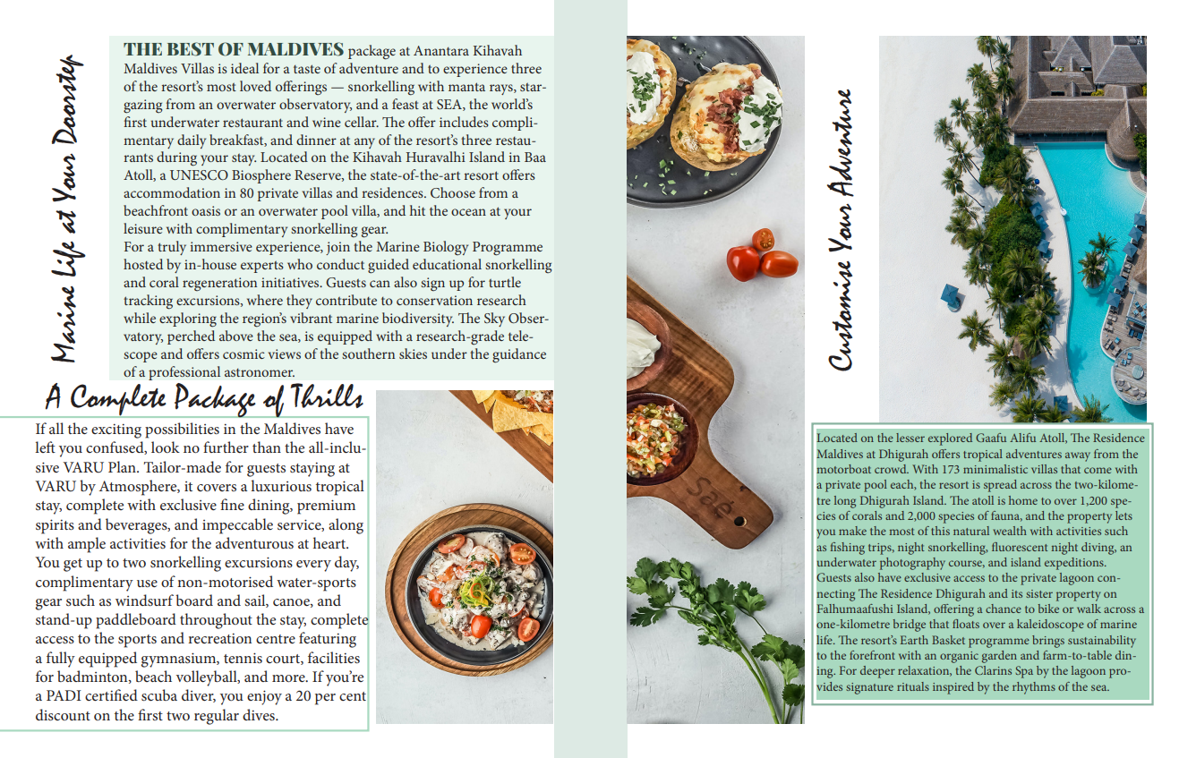
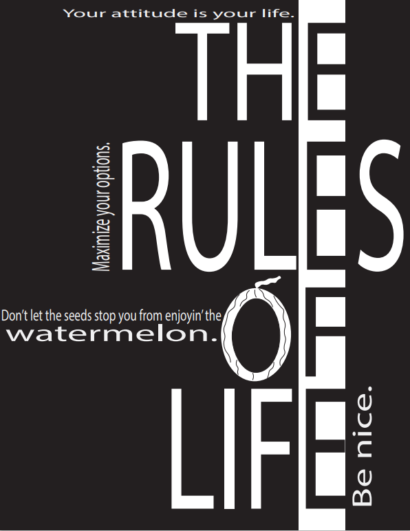
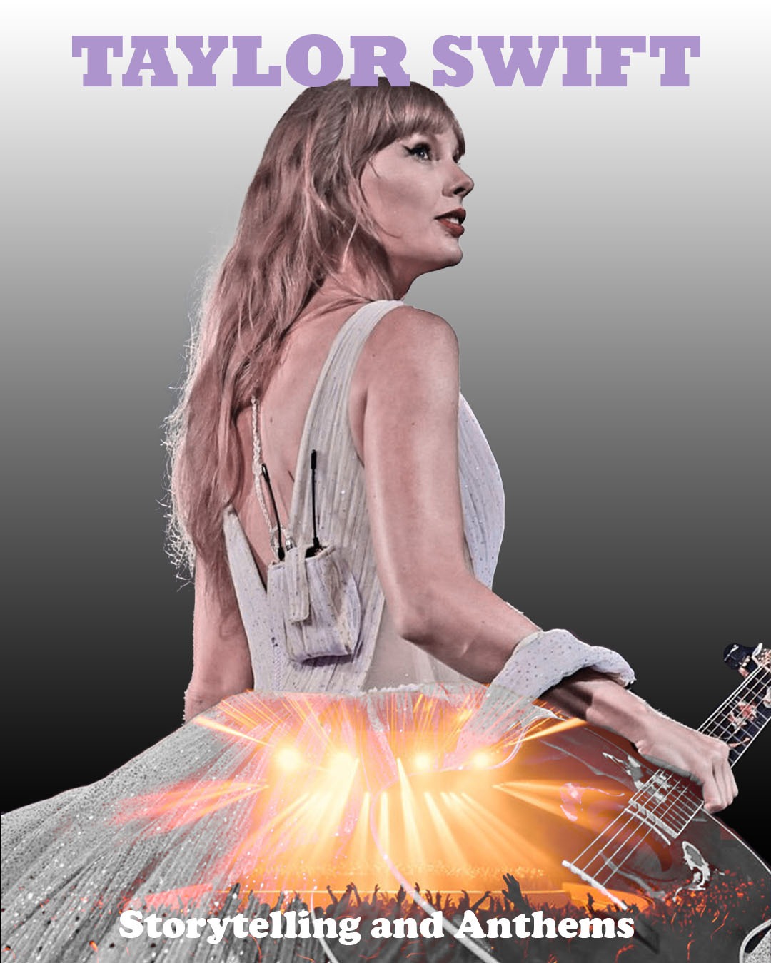
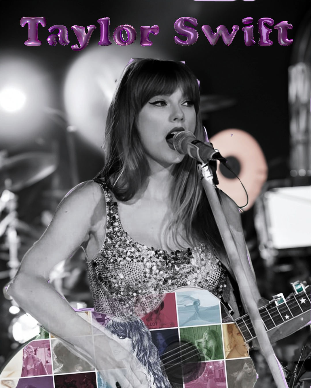
I designed a professional magazine spread with a focus on editorial layout. This included careful consideration of grid structures, typography, and image placement to create a visually cohesive and engaging reading experience.